

In this project, we deepened our understanding of type, learning to recognize "tasty bits" within the letterforms and what they portray rather than paying attention to the entirety of the typeface.
We derived six "tasty bits" from seven fonts which piqued our interest to create an interesting composition that displays visual hierarchy and mood. The final 24 x 39 inch poster was created in InDesign using overprinting.
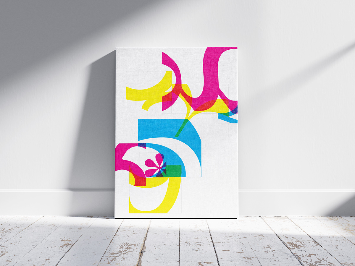
The use of overprinting creates an overlap between the magenta, cyan, and yellow colored tasty bits to further the emphasis on the shapes and hierarchies derived by the size and orientation of each tasty bit.


In addition to the original poster created, the design was tested on a pillow to see how it could be implemented in the real world.

We also reimagined are posters to be billboard-sized to emphasize the importance of visual hierarchy within the project. In this blown-up version, the use of hierarchy guides the viewer's eye throughout the composition.


